Font(s) of Knowledge
As you sit there reading the letters on this page, you’re actually looking at symbols from the distant past. Take the two oldest letters in our alphabet, “X” and “O”; they were created by the Phoenicians more than 3,000 years ago. Most of the rest of the “modern” alphabet was created by the Greeks and Romans a few centuries after that. (The term alphabet is derived from the first two Greek letters, alpha and beta, which still look like “A” and “B” today.) Even the younger letters, such as “J” and “U,” are hundreds of years old.
What has changed a lot over the centuries is how these letters have been chiseled, written, and printed. Yet the desired effect is the same- to convey a specific message. When people speak, their words make up only a portion of what they’re trying to communicate. Additional information is conveyed by their tone, volume, posture, and even the setting. This principle works for reading as well: The font acts as the world’s “body language.” The study and creation of this language is called typography, from the Greek typo (“impression”) and graphy (“writing”).
Font or Typeface?
The terms typeface and font are often used interchangeably, but technically they’re not the same thing. A typeface is a lettering style that was created by a designer (called a typographer), whereas a font is a set of guidelines for how a specific letter, symbol, or number within a specific typeface should appear. Helvetica, for example, is a typeface. An example of a font might be “Helvetica 10-point bold italic.” Today, typefaces are primarily created on computers, but their history goes back more than a thousand years. There are an estimated 100,000 typefaces in existence. Here are the stories behind a few of them.
WHOCARESABOUTREADABILITY?
In A.D. 781, a scholar named Alcuin of York was tasked with creating a uniform script to be used throughout Charlemagne’s empire, which covered most of Europe. Lettering had changed very little since the fall of the Roman Empire in the 400s, except that it had become even more difficult to read. There were no lowercase letters, no breaks between words, and no punctuation. Everything was hand-written by scribes, each of whom added his own flair. Alcuin’s style of script, which we now call carolingian minuscule, helped put an end to that. Here’s a sample:
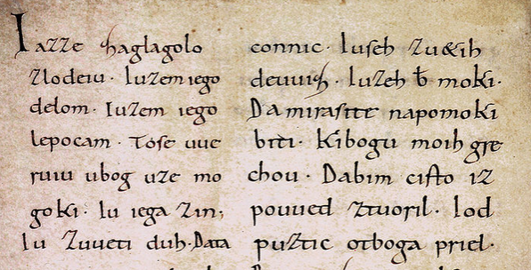 This typeface remained the standard long beyond Charlemagne’s rule and into the 1200s, but as time went on, it too became increasingly difficult to read as new scribes added new embellishments. The strokes of the letters got thicker, and the ends of the strokes got spikier. Result: carolingian minuscule went from what you see above to something resembling this:
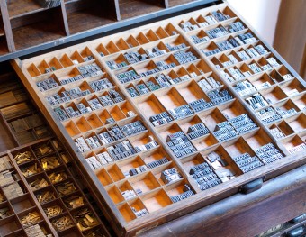
 Variations of this style of lettering, also called Old English and Textura, were used by monks who toiled away with ink and paper in small rooms called scriptoriums for months or even years just to make a single book. That was the norm until the mid-1400s when a German goldsmith named Johannes Gutenberg (1398-1468) realized that he could make a lot of money printing Bibles that appeared as if they were lettered by hand, but were made in a fraction of the time. There were a few rudimentary printing methods in use in Europe and the Far East, but the most popular one- block printing – was really only useful for printing pictures, not words. Utilizing his metalworking skills, Gutenberg created the movable type system in which individual letters and numbers could be carved out of soft metal, cut out with a punch-cutter, and then placed (in reverse) to form a page of text. Then, using new oil-based inks, these letters could be transferred onto pages.
The impact of Gutenberg’s printing press cannot be underestimated- it effectively ended the so-called Dark Ages and ushered in a new era of literacy in which books became available to the average person. (And his basic method of printing was the norm until the 1970s.) Yet Gutenberg was equally important to the world of typography: The 270 individual letters and numbers he created at difference sizes are considered the first true fonts.
Why is his typeface called “gothic”? It was the Italians who gave it the name. In Italy in the 1500s, the word gothic was an insult meaning “barbaric.” Because the Italians blamed the fall of the Roman empire on the Germanic tribes- called Goths- who sacked Rome in the 400s, anything resembling Germanic culture, from their spiked architectural building styles to their hard-to-read, spiked letters, was considered “gothic.”
Garamond (1550s)
Claude Garamond (1480-1561) was a French bookmaker who refined Gutenberg’s movable type system to make it even easier to operate. He’s also one of the pioneers of roman type, so named during the Renaissance because it harkened back to the letterforms used in ancient Greece and Rome. Back then, because each letter had to be chiseled by hand, the carvers created typefaces that required few strokes. The Latin alphabet (which consisted of only capital letters) mirrored the Greco-Roman ideals of symmetry, proportion, and geometry- thin lines with rounded tops, akin to arches. Garamond brought back a unique feature of the roman text: serifs, the little notches and hooks at the ends of letters. During his lifetime, Garamond was most famous for his Greek typestyles, which he designed on commission from King Francis I. Today, however, he’s known for the typeface family that bears his name. Garamond has been a favorite font of book printers for nearly 500 years. (Italic type, a slanted version of roman type, was created by Italian Francesco Griffo in the early 1500s.)
Caslon (1722)
You may not recognize the name, but Caslon- designed by Englishman William Caslon in 1722- is widely considered to be the first typeface created in English. When British foundries started shipping the metal forms of Caslon to presses in the New World, they had no way of knowing that American revolutionaries would one day use this “British national type” to print the first copies of the document that would free America from British rule:
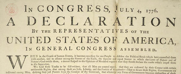 After that, Caslon fell out of favor in the United States for decades- mostly because of its ties to England, from which the new nation wanted to distance itself. In the mid-1800s, old type-styles started to become fashionable again and Caslon staged a comeback. (Playwright George Bernard Shaw insisted that all his works be set in the typeface.) By the early 20th century, the mantra among typesetters on both sides of the Atlantic was, “When in doubt, use Caslon.” More-contemporary fonts would soon take over, but in recent years Caslon has been making another comeback.
Times New Roman (1932)
Stanley Morison (1889-1967) was among the 20th century’s most influential typographers. Employed by the Monotype Corporation, he was responsible for the resurgence of several nearly obsolete fonts, including Bodoni, Garamond, Baskerville, and Bembo. In 1931, while serving as a consultant to The Times of London, he criticized the newspaper’s outdated typeface. So Times-London bosses commissioned him to come up with a better one. Morison based his design on the roman serif font Plantin, sometimes referred to as Times Old Roman, but he made it much easier to read. A year after its 1932 debut, The Times gave up its ownerships rights to the typeface, making it freely available to any newspaper that wanted to use it. However, because Times New Roman prints best on white paper, few other newspapers used it. Why? Because most newspapers used a darker grayish stock. Instead, Times New Roman became the preferred typeface for books and magazines. A close derivation of Times New Roman is used for the title font of TIME magazine. But don’t go looking for that font online; the title was created by a graphic artist by hand. And he only created the word TIME.
Goudy (1915)
Frederic William Goudy (1865-1947) was an American artist, publisher, teacher, and typographer. He designed more than 100 typefaces, the most lasting of which bears his name. Its main benefit: The small descenders (the part of a letter that falls below the baseline) allow for more lines per printed page. Goudy spent much of his career creating scripts for advertising purposes, but that pursuit felt hollow to him, so he spent his later years working as an instructor; he mentored some of the 20th century’s most influential typographers. But what Goudy really wanted to do was create the “perfect” roman script, so he built a foundry at his New York home to experiment with new designs. Sadly, it was destroyed by a fire before he could finish.
(Bathroom Reader’s Institute history note: In 1988, when Uncle John was putting together the first Bathroom Reader, he asked the BRI’s go-to designer, Michael Brunsfeld, to suggest a font for the book’s title. One of Michael’s picks was Goudy. Uncle John liked it so much that we decided to use it for both the title and the text you see in the Bathroom Reader pages.)
Courier (1956)
Technically, Courier is a “monospaced slab serif” typeface (each letter takes up the same amount of horizontal space), but it’s commonly known as the “typewriter font.” That’s what Howard Kettler had in mind when he designed it for IBM in 1956. Because of IBM’s dominance in the typewriter market, Courier (and dozens of subsequent imitations) became very popular. One place you may recognize it- on de-classified government documents with blocks of text blacked out. The U.S. State Department used Courier because it was monospaced, making it more difficult for snooping eyes to identify the blacked-out letters. In 2004, the State Department switched to Times New Roman, which has consistent spacing and is much more readable (except the blacked-out parts).
Palatino (1948)
German typographer Hermann Zapf, born in 1918, is one of the most prolific (and copied) type designers in modern history. His most famous typeface is Palatino, which he designed in 1948. He named it for the Italian writing master Giovanni Battista Palatino, a contemporary of Michelangelo and Claude Garamond. Zapf didn’t just copy a Renaissance script, though; he used it as inspiration for a roman serif font that’s legible and attractive- suitable for both title and body text.
Since writing began, scribes have used “non-letterform glyphs” to add visual pizzazz to their work: stars, flowers, scrolls, borders, toilet paper rolls, etc. By the 1800s, these glyphs were known by so many different names- including ornamentals and fleurons- that printers simply called them dingbats, the 19th-century equivalent to “thingamajigs” or “watchamacallits.” Today, there are hundreds of symbol fonts to choose from, the most famous of which (printed above) is Zapf Dingbats, created by Hermann Zapf in 1978.
Futura (1928)
The French word sans means “without”; hence, sans serif letters lack notches and hooks. (This ![]() has serifs; this T does not.) Although the sans serif style dates back to ancient Greece, it didn’t really catch on among designers and printers until the 19th century. And even then, most European typographers thought letters without serifs were ugly (which may explain why they’re also called grotesque fonts). The style got a big boost in the 1920s thanks to the German Bauhaus movement of modern art, which stressed function over style- no unnecessary elements. The most famous sans serif typeface to come out of this movement is Futura, created in 1928 by German typographer Paul Renner. His goal was to combine the strength of gothic type with the elegance of roman type, all while staying within the strict boundaries of the Bauhaus movement. Futura was revolutionary for its time: Advertisers used it to show that their products were clean and refined (as a contrast to the dirty coal-burning technology of the day). Futura and the other sans serif typefaces that followed were mainly used in titles and headlines. Aptly, the commemorative plaque that Apollo astronauts left on the Moon in 1969 is set in Futura. Also, the floating title of the TV show LOST is set in the typeface. And if you spend a lot of time browsing the Internet, you’ll see that Futura is used for the body text on many websites because of its readability.
has serifs; this T does not.) Although the sans serif style dates back to ancient Greece, it didn’t really catch on among designers and printers until the 19th century. And even then, most European typographers thought letters without serifs were ugly (which may explain why they’re also called grotesque fonts). The style got a big boost in the 1920s thanks to the German Bauhaus movement of modern art, which stressed function over style- no unnecessary elements. The most famous sans serif typeface to come out of this movement is Futura, created in 1928 by German typographer Paul Renner. His goal was to combine the strength of gothic type with the elegance of roman type, all while staying within the strict boundaries of the Bauhaus movement. Futura was revolutionary for its time: Advertisers used it to show that their products were clean and refined (as a contrast to the dirty coal-burning technology of the day). Futura and the other sans serif typefaces that followed were mainly used in titles and headlines. Aptly, the commemorative plaque that Apollo astronauts left on the Moon in 1969 is set in Futura. Also, the floating title of the TV show LOST is set in the typeface. And if you spend a lot of time browsing the Internet, you’ll see that Futura is used for the body text on many websites because of its readability.
Helvetica (1957)
In 1957 Swiss typographers Max Miedinger and Eduard Hoffmann set out to create a typeface that was simple, elegant, and modern. Based on a German sans serif font called Akzidenz-Grotesks, they called their design Neue Haas Grotesk (it was created and formed at the famous Haas foundry in Switzerland). In 1960 the typeface was refined and renamed Helvetica, based on the Latin Helvetia, which means “Swiss.” Helvetica was an instant hit: Corporations liked it for its neutral tone; advertisers, for its readability. It became one of the most popular fonts of the 20th century, especially for transportation: New York City Subway signs, the logos for Jeep and TOYOTA, and millions of road signs.
Arial (1982)
You don’t see Helvetica used on most computers. Instead, you see its look-alike, Arial. Why are these two typefaces almost identical? In the 1980s, Helvetica became a standard system font in Apple Macintosh computers, but a battle (that’s still being waged today) was brewing: Adobe Software Systems purchased the Helvetica family of typefaces directly from Haas for use in its TrueType system. Result: Adobe won the respect of the typography industry by purchasing the rights directly from Haas, as opposed to going with some cheap knockoff…but only Adobe had the coding required to display it clearly on a computer screen. When it came time for Microsoft to choose its own default system font, instead of using Helvetica and being at the mercy of Adobe’s software, the computer giant went with a cheap knockoff, Arial, designed in 1982 by Robin Nicholas and Patricia Saunders from Monotype.
Century Gothic (1991)
Why is this typeface- based on Twentieth Century, a 1930s design by Sol Hess of Monotype- called Century Gothic, when it seemingly has little in common with Germanic texts still refereed to as Gothic Blackletter? Because “gothic” is an outmoded typographic term for sans-serif, so named because of the type color of early sans-serif typefaces was similar to that of blackletter script. Also, unlike roman typefaces like Garamond or Goudy, both are sans serif (the spikes and adornments on old gothic faces aren’t considered true serifs). The script kept the strength of gothic-style letters, but featured a large x-height (a typographer term, referring to the height of a lowercase “x” in any particular font). Century Gothic proved great for advertisements, which is where you’ll see it used the most.
Film note: A similar typeface called News Gothic (designed by Morris Fuller Benton in 1908) is familiar to any movie buff in the words “A long time ago, in a galaxy far, far away…”
Trajan (1989)
In 113 A.D., a 100-foot-tall column was erected in Rome to celebrate Emperor Trajan’s victory in the Dacian Wars. Etched into the base is a dedication set in classic Roman script. Ever since the Renaissance, typographers have attempted to create typefaces based on this script, including Frederic Goudy and Hermann Zapf. In 1989 a modern version of Trajan was created by Carol Twomby, a type designer working for Adobe. Like the true Roman alphabet, Trajan has no lowercase letters. As was the case with Helvetica and Times New Roman before it, many graphic designers condemn Trajan for committing the greatest sing of any typeface: overuse. Who overuses it? Hollywood movie poster designers, as evidenced by the posters for Apollo 13, Titanic, The Da Vinci Code, Sex and the City, Black Swan… and so on.
In 1994 Microsoft typographer Vincent Connare opened a test version of a welcome screen for kids that featured a cartoon dog speaking with a text bubble. Connare immediately saw that the words were set in Times New Roman. “That’s not a good font for kids,” he told his bosses. So they told him to create one that would be. Connare drew inspiration from 1980s Batman and Watchmen comic books and came up with Comic Sans. It has since become one of the typefaces most reviled by designers. Why? Although Comic Sans was designed for kids, Microsoft added it to its font menu on home computers. And within a few years, Comic Sans was showing up all over the place. From church bulletins to restaurant signs, amateur designers frequently chose Comic Sans for their projects. It grew even more common when it became the default font in many instant-messaging programs. It’s become so hated that there’s a “Ban Comic Sans” movement online, initiated by designers Holly and David Combs in 1999. Their manifesto reads in part:
Like the tone of spoken voice, the characteristics of a typeface convey meaning. The design of the typeface is, in itself, its voice. Often this voice speaks louder than the text itself. Thus when designing a Do Not Enter sign, the use of a heavy-stroked, attention commanding font such as Impact is appropriate. Typesetting such a message in Comic Sans would be ludicrous.
So far, they’ve gathered about 5,000 signatures for a petition to “eradicate” the font. They even have a favorite joke: “Comic Sans walks into a bar, the bartender says, ‘We don’t serve your type!'”
 This article is reprinted with permission from Uncle John’s 24 Karat Gold Bathroom Reader. The information miners at the Bathroom Readers’ Institute have unearthed a priceless collection of surprising, amazing, headscratching, and hilarious articles. 24-Karat Gold is chock-full of little-known history, random origins, weird news, celebrity secrets, and urban legends.
Since 1987, the Bathroom Readers’ Institute has led the movement to stand up for those who sit down and read in the bathroom (and everywhere else for that matter). With more than 15 million books in print, the Uncle John’s Bathroom Reader series is the longest-running, most popular series of its kind in the world.
If you like Today I Found Out, I guarantee you’ll love the Bathroom Reader Institute’s books, so check them out!
| Share the Knowledge! |
|



Too many misspellings for an article on typography. E.g. Referred is not spelled ‘refereed’.
@Eric Shilling: Typos happen
More serious than the typos is the statement that the effect of the printing press “cannot be underestimated.” This means that no matter how low your guess, you’ll never underestimate it…the desired word is, of course, “OVERestimated.”