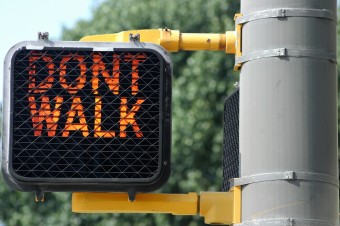
Why Don’t They Bother Putting the Apostrophe in “DONT WALK” signs?
 No one is sure when exactly the first WALK/DONT WALK style signs were installed. Even the Federal Highway Administration isn’t sure, though it is thought that the first such sign was likely installed sometime in the early to mid-1930s.
These signs didn’t say “WALK/DONT WALK” at all. Rather, according to the FHA, the earliest signs that signaled when pedestrians could walk used the words “WALK” and “WAIT” or a combination of colored lights not dissimilar from traffic lights today. The first definitive example of a signal that used “WALK/DONT WALK” was a neon sign installed in Washington DC on January 1, 1939 which you can see pictured here.
As for the now iconic New York style “WALK/DONT WALK” signs that the majority of you will likely be familiar with, these weren’t introduced until 1952, by which time the “WALK/DONT WALK” format was considered the industry standard.
As for the whole apostrophe usage issue, there are certainly examples of WALK/DONT WALK signs out there that have an apostrophe present, though they are incredibly rare. As noted in this 1962 article in the New Yorker, DONT WALK signs in Denver Colorado featured apostrophes while the signs in New York did not.
So what is going on here? One theory as to why DONT WALK signs lack an apostrophe is that it simply makes the command more immediate and clear, which is vital when you’re dealing with something designed to stop people walking into roads. While this may seem farfetched, a reasoning similar to this was given when a British city, Birmingham, eliminated apostrophes from street signs in 2009. A councillor asked to defend the decision was quoted as saying that “[apostrophes] confuse people”.
This decision (which was later overruled) was kicked into motion by the introduction of a new guideline in Britain which stated that apostrophes had the potential to confuse workers in the emergency and postal services.
As for how this relates to DONT WALK signs, well, one of the reasons the signs began to be phased out in 1999/2000 was because they were difficult for people who didn’t speak English to understand. In an effort to make the signs cross all cultural and language barriers, they have since been largely replaced in many states by signs sporting a simple stick figure of a walking man and a raised hand.
With that in mind, another theory is that besides making it simpler, excluding the apostrophe also makes it shorter, similar to how the word “crossing” in deer crossing signs is stylised as XING.
That said, as we’ve already shown in this piece, there are examples out there of DONT WALK signs with apostrophes (and many of the earliest examples weren’t the box-style with DONT above WALK, so no need to worry about matching the spacing there). So the idea that you couldn’t fit an apostrophe onto one is very clearly false.
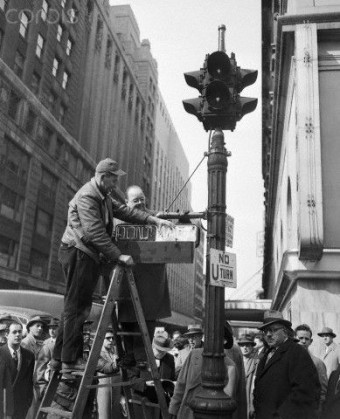
 However, we have another theory that, at least to us, seems most tangible of all. As you can see in this picture from 1952 (pictured right) of one the first WALK/DONT WALK signs in New York to be installed, the letters “N” and “T” in the word “DONT” in this neon sign are made from a single piece (a common way to make these signs at the time, and as mentioned the first known WALK/DONT WALK sign from 1939 was also a single-piece neon sign).
So it is possible that the apostrophe was excluded simply because it was more difficult to include it in those types of single-piece neon signs. This wouldn’t be an issue in more modern signs, but manufacturers stuck with the lack of apostrophe seemingly out of tradition, and possibly because, as the Birmingham council member noted, “[apostrophes] confuse people”.
If you liked this article, you might also enjoy our new popular podcast, The BrainFood Show (iTunes, Spotify, Google Play Music, Feed), as well as:
- The Origin of the Green, Yellow, and Red Color Scheme for Traffic Lights
- Many Crosswalk Signal Buttons Don’t Do Anything Anymore
- Why Some Countries Drive on the Right and Some Countries Drive on the Left
- Origin of the Term Jaywalking
- The First Speeding Infraction in the U.S. was Committed by a New York City Taxi Driver in an Electric Car on May 20, 1899
| Share the Knowledge! |
|


Well, they don’t put a full-stop either, and no-one says anything about that.
Horizontal neon pedestrian signals didn’t have room to wrap the tube to make a legible apostrophe while the vertical (DON’T over WALK) neon signals, such as made by Econolite (popular in the west) had room to make a little wiggle in the tube that represented a somewhat backward apostrophe. For simplicity sake, DONT was subsequently used in the flat panel incandescent signals made by companies such as Marbelite and Eagle (popular in the east.)